Tuesday, September 29, 2015

Fast Fix for Wide Web Pages

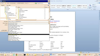
When I revise my resume, my last step is to use the Save As dialog box, off the File menu, in Microsoft Word 2010, to save the resume as a filtered HTML document. The option is easy to miss in the long list of formats displayed in the “save as type” combo box, shown in the picture below.

When you select the option, Microsoft Word changes the file extension accordingly, then displays the new name, and asks you to press an OK button to accept the selected name. When you do so, the following message box appears.

When you acknowledge this caution, the main window displays the file more or less as it will appear in a Web browser. My display looks like this.

The Web browser rendering, using Google Chrome 45 (64 bit) looks pretty similar.

You can see how it looks in your Web browser at http://www.wizardwrx.com/Company/David_A_Gray_CV_Condensed_20150929_163354.html.

I think most people would agree that the page shown below, accessible at http://www.wizardwrx.com/Company/David_A_Gray_CV_Condensed.html, is much easier to read.

So how do you get from that to this?

Over the years, I have tried numerous tricks, until I discovered that the Style attribute can be applied to the Body tag, and used to coerce the Web browser to confine the text to a specified width, even when a full screen window is much bigger.

Applying a style to the body tag fixes it with one tiny edit of the raw HTML, and if you use any version of Microsoft Windows, you already have the only tool you need, Notepad!

I have many other tools at my disposal, and I seldom use Notepad for this task, or any other. However, since it is everywhere, I shall demonstrate how to use Notepad to do the job.

To open a Web page in Notepad, you will need to change the file type combo box from Text Files (the default) to All Files, as shown below.

Select the file, then press the Open button to display the file. Your screen should resemble the following picture.

Use the Find tool, which appears about halfway down the Edit menu, as shown below.

Input the following text into the box labeled “Find What”: <body; use only the text shown in blue. Press the Find Next button once; every HTML document contains exactly one opening Body tag.

Dismiss the Find dialog box by pressing its Cancel button. Your display should look something like this.

The change happens at the angle bracket at the other end of the body tag, which is highlighted in the next picture.

The secret sauce goes immediately in front of the angle bracket, and is highlighted in the next picture.

Save the document, and close Notepad. Your reformatted Web page is ready for viewing and display.

In closing, there is nothing special about the chosen width of 6.65in, other than that it is approximately the width of the body of a standard document laid out in a portrait orientation for printing on US Letter size (8.5 inches wide by 11.0 inches tall) paper, with left and right margins of one inch.

Saturday, August 1, 2015

Windows 7: Library Lunacy

I almost always run the Windows 7 File Explorer in Details view, with a customized selection of columns.
One day, when I was browsing a directory into which I had navigated from a Windows 7 library, I noticed that a column that I expected to see, and needed to inspect, was missing. What happened to the Attributes column, I wondered. Then, it occurred to me that this session had begun in a library. The view looked like Figure 1.
Figure 1 is a subfolder of my personal Documents library.
When the File Explorer displays a library, one of the options on the context menu of any file is “Open File Location,” shown in Figure 2.
Figure 2 is the context menu of a file in my Documents library, displayed by highlighting the file to select it, and pressing the right  mouse button.
Invoking the selection shown in Figure 2 updated the File Explorer window as shown in Figure 3, revealing the missing column.
Figure 3 is the updated File Explorer, showing the file location, including the missing Attributes column.
On further investigation, I discovered that when the File Explorer displays a library, the Customize This Folder option is absent from the View menu. Switching to a file location view, I could display the Customize This Folder dialog box, shown in Figure 4, Absent from the list of folder types is Library. Testing the five views indicates that none of them corresponds to the layout shown in Figure 1.


Figure 4 is the Customize This Folder property sheet, with the “Optimize this folder” combo box expanded to reveal the five available views.
Thankfully, further experimentation confirmed that details selected when a folder is displayed as a library apply to all library views, and are apparently stored in a sixth view that isn’t shown in the user interface.
Distinguishing Library Views from File System Views
Many times, Windows gives subtle clues, and this is no exception. Carefully comparing the address bars shown in Figures 1 and 3 reveals that the first breadcrumb in Figure 1, a library view, is the name of the library (Documents), while the first breadcrumb in Figure 3, a file system view, is a user name (DAVE). In this case, the second and subsequent breadcrumbs are the same, because the top folder in the Documents library is also called Documents, corresponding to its name in the file system, directly off the user folder, DAVE.
Lessons Learned
  1. You cannot directly apply one of the standard views (General Items, Documents, Pictures, Music, Videos) to a library.
  2. One combination of selections applies to all Library views.
  3. This one combination is fully configurable, as are the five standard folder views.
One more of the little mysteries and annoyances of Windows 7 is finally solved!

Sunday, July 19, 2015

Line Wrap in PowerPoint Slide Footer: Using Sizing Handles to Control Text Flow

In the course of revising a nine year old PowerPoint presentation that
accompanies an article that I just updated and published, I was reminded why
PowerPoint is so easy to use, and is a good example of well-designed,
well-implemented software.

Along the lower edge of the slide master are three text boxes, intended to
hold a date stamp, a slide number, and a footer that can contain anything,
such as a copyright notice. On this slide master, the footer reads as
follows: "C 2015 David A. Gray, MBA. All rights reserved." When I copied
this text from the title slide, it wrapped between the words "all" and
"rights," and looked sloppy. As I was about to set the presentation aside
and start the next task, a light bulb in my head switched on. The
inspirational light bulb cast its bright light on the sizing handle at the
right edge of the text box. I wondered what would happen if I dragged it to
the left a tad. Watching the text as I dragged the selection handle about
1/2 centimeter, I was delighted that the text re-flowed, wrapping exactly
where I wanted. Tapping the F5 key to start a slide show, I noted with
complete satisfaction that the change had the desired effect on the way the
copyright notice displayed on all but the title slide, from which it was
intentionally omitted.

In far too many cases, I have found that text boxes were a PITA to be
avoided at almost any cost. Nevertheless, as is the case with many
infrequently used features of general purpose software such as PowerPoint,
Excel, and Word, text boxes are there for a reason, though the reason
frequently isn't immediately apparent. It may take just the right
circumstances to reveal to you why you need it. Moreover, you and I may
discover completely unrelated applications for the same feature.

The next time your document contains text that doesn't flow the way you
want, if it's in a text box, look for sizing handles, and use them to
control the way it flows. If your text isn't in a text box, consider
embedding it in one, and using its sizing handles to control the way it
flows.